Chēn
Architecture
- Scope
- Naming
- Brand Positioning
- Verbal & Visual Identity
- Location
- Singapore
- Sector
- Architecture
- View on Behance
Chēn Architecture is a Singapore-based firm specialising in high-density design for the rapidly evolving cities of Southeast and East Asia, founded by Eleanor Chen in 2019.
A third path.
The practice emerged from a specific frustration: that so much contemporary Asian architecture either mimicked Western modernism or performed traditional motifs as surface decoration.
Chēn sought a third path — architecture that engages Asian spatial concepts without nostalgia, and treats density as a design opportunity rather than a constraint.
Beyond nostalgia and mimicry.
We named the practice and positioned it around one line: “Beyond nostalgia and mimicry.”
The wordmark’s macron gives the name its exact pronunciation — a quiet mark of precision.
What we did- Naming
- Brand positioning
- Verbal identity
A system grounded in material.
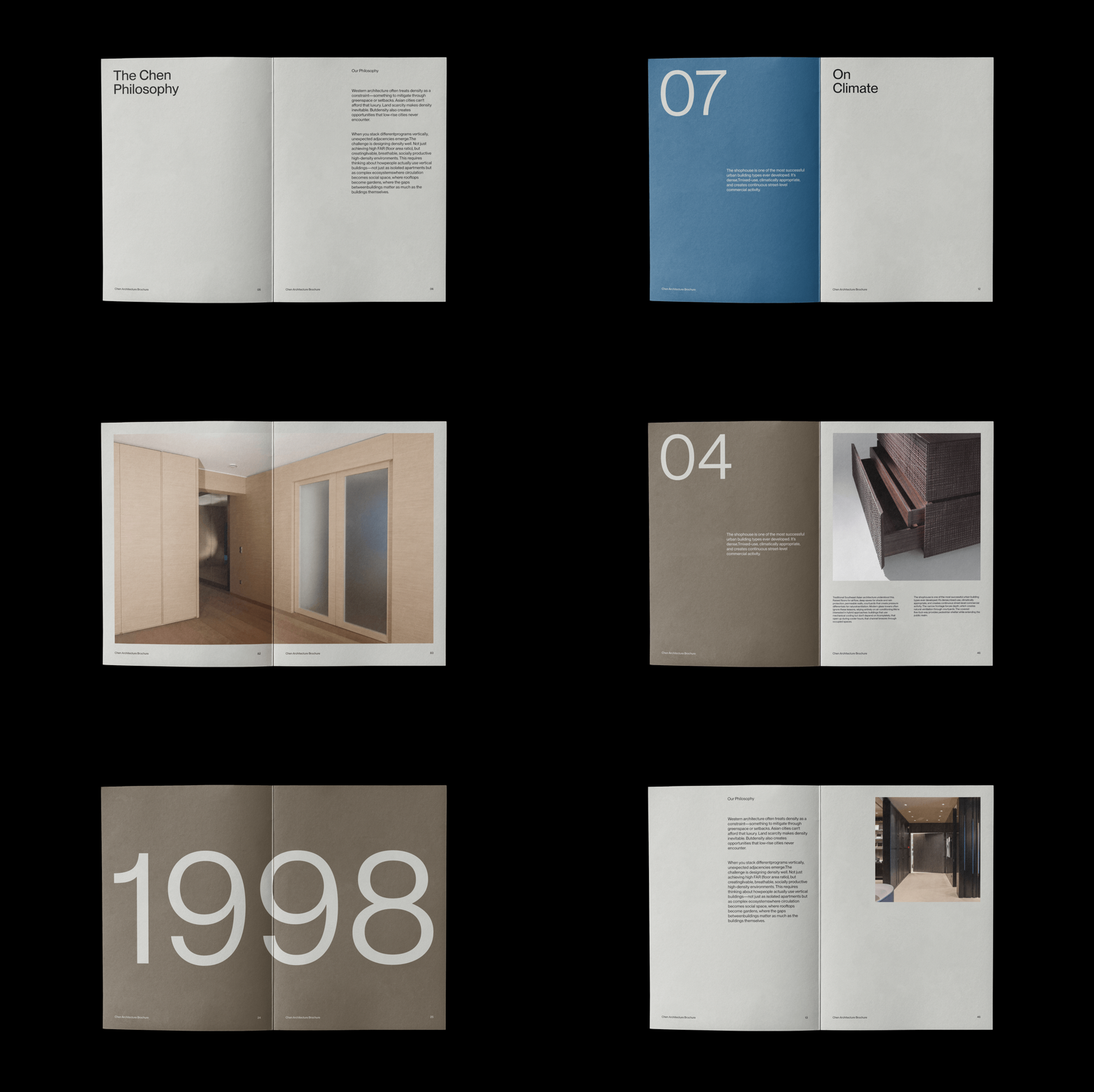
Neue Montreal brings structural neutrality, and a palette of Limestone, Stone Brown, Graphite, Blueprint and Blackout grounds the system in material.
Architectural drawings carry it from stationery and brochures to signage and the studio’s film.
What we did- Wordmark
- Typography
- Colour palette
- Stationery and brochures
- Signage
- Studio film




Download the Chēn project images.
23 images · ZIP · 9.3 MB. For press and portfolio use — please credit KWIBA®.
Download project images