Asoma
Architecture
- Scope
- Naming
- Brand Identity Design
- Collateral Design
- Location
- Berlin, Germany
- Sector
- Architecture
- View on Behance
Asoma is an architecture practice that approaches each project as a collaboration — clients, architects, engineers and craftspeople at the same table from the first sketch.
Craft, clarity and care.
The practice needed a name and identity that captured that spirit: bringing architecture together through craft, clarity and care.
Where every building starts.
ASOMA starts where every building starts: with a point. A column position, a survey mark, a decision to place something with intent.
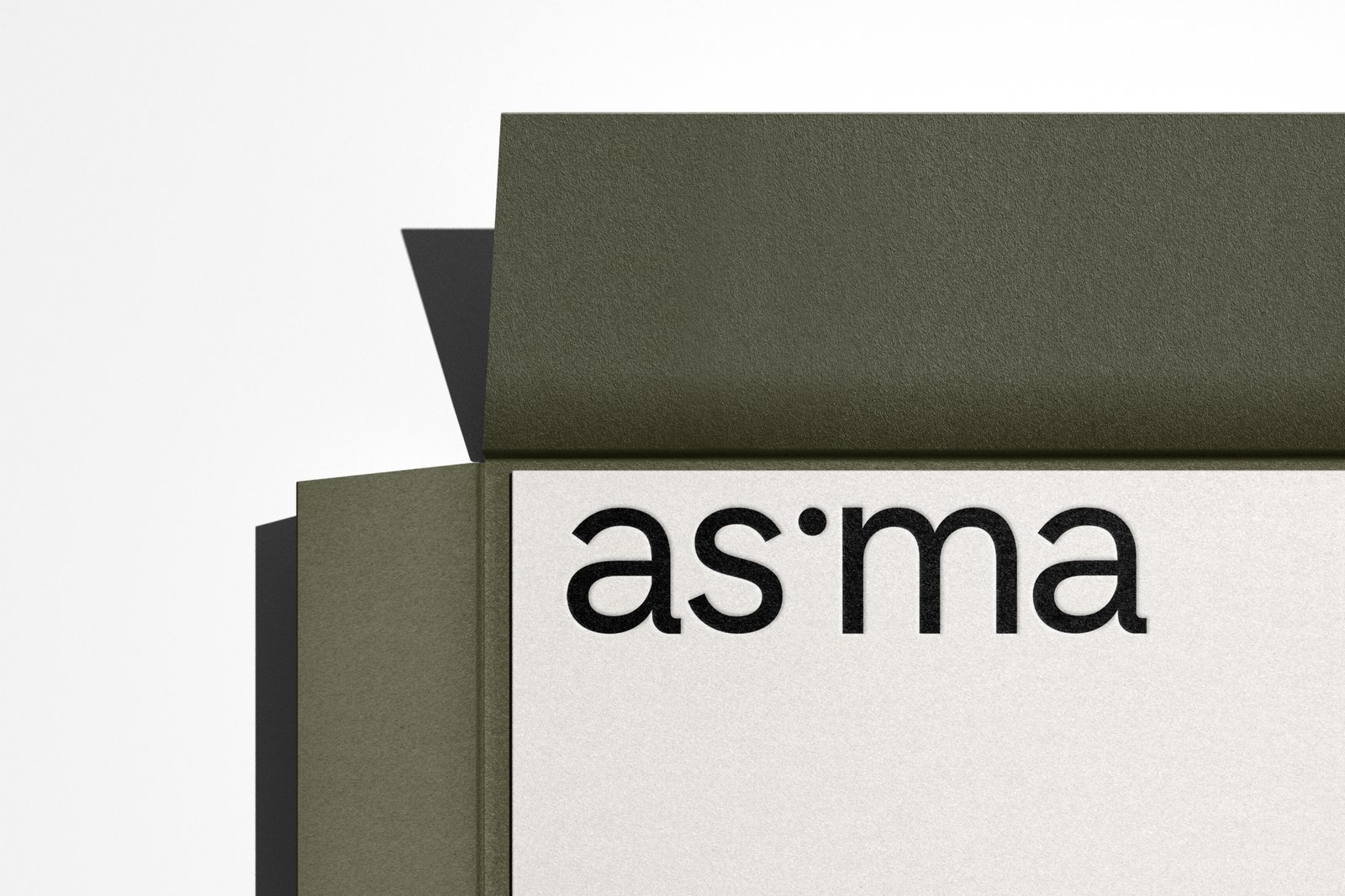
We made that mark the heart of the identity — a solid dot that replaces the “o” and turns a name into a drawing.
What we did- Naming
- Brand identity design
Earthy, calm and grounded.
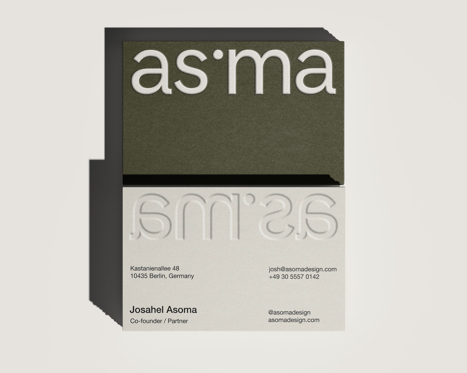
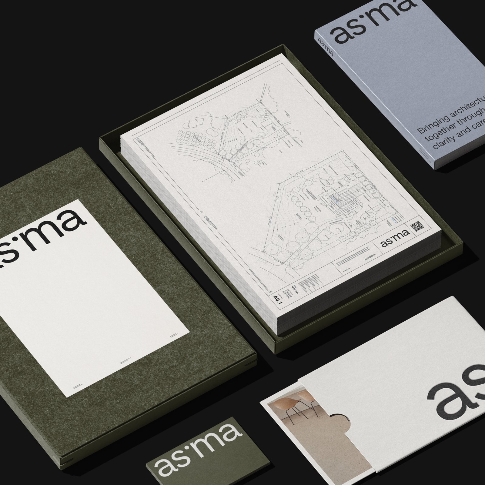
A palette of deep olive and bone white is earthy, calm and grounded.
The lowercase wordmark sits low and large, like a plan anchored to its sheet — one small point organising an entire brand, from a business card to a billboard.
What we did- Collateral design
- Business cards
- Billboard








Download the Asoma project images.
17 images · ZIP · 7.1 MB. For press and portfolio use — please credit KWIBA®.
Download project images