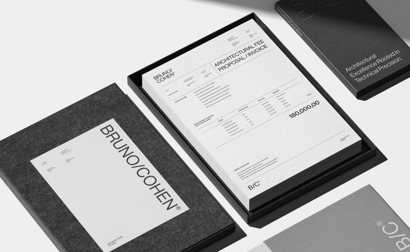
S/opp Architecture
- Scope
- Naming
- Brand Identity
- Typography System
- Brand Positioning
- Location
- Oslo, Norway
- Sector
- Architecture
- Awards
- Online Design Awards — Winner 2026, Brand Identity & Brand Collateral
- Best of Behance
- Published
- Abduzeedo
- View on Behance
S/opp Architects is an Oslo-based practice specializing in cooperative housing, student villages, and mixed-income communities.
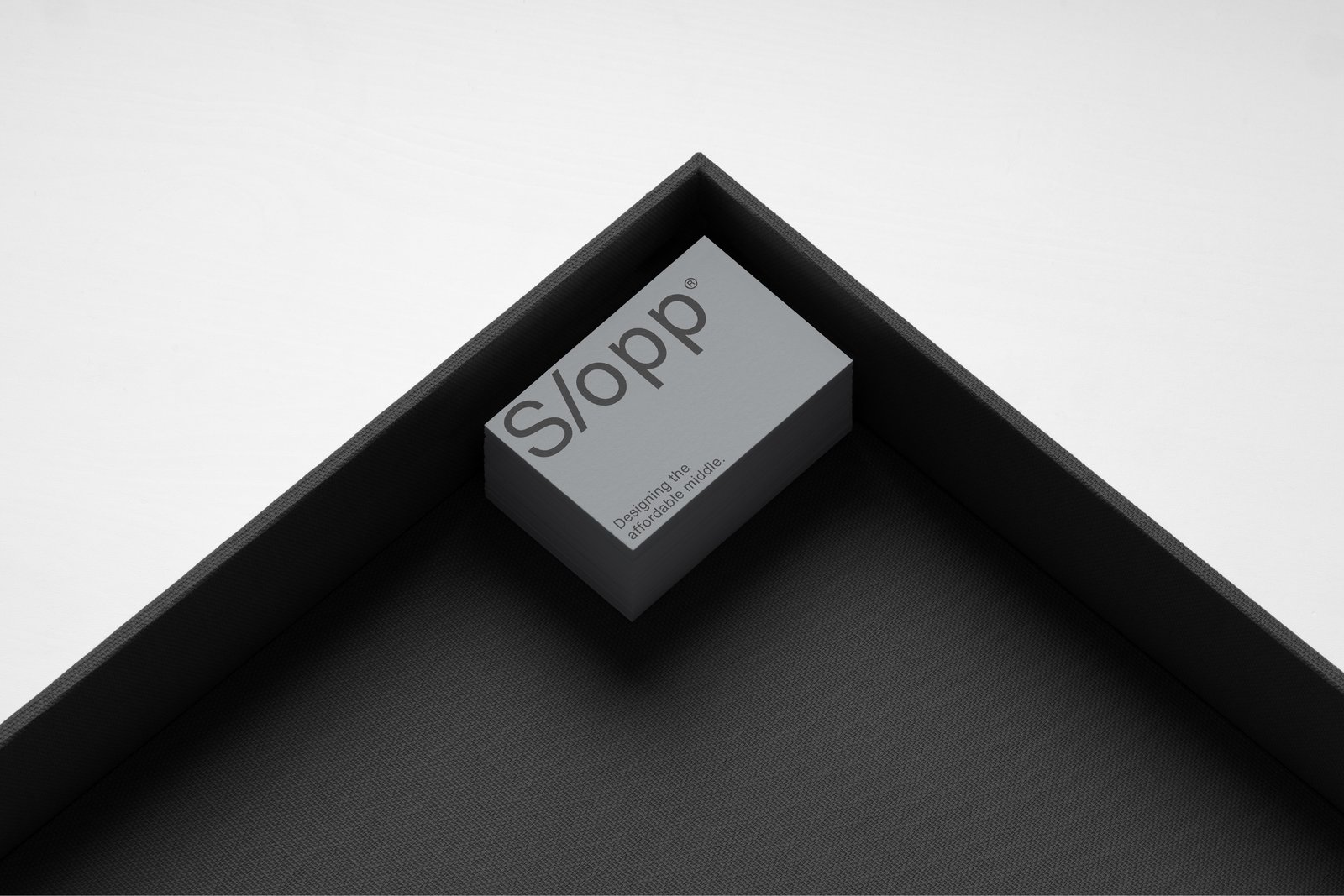
Premium within real budgets.
Founded on the belief that spatial intelligence can deliver premium living within realistic budgets, the firm needed a brand identity that honored both its technical rigor and its social purpose — without sacrificing the premium feel their work deserved.
Precision with purpose.
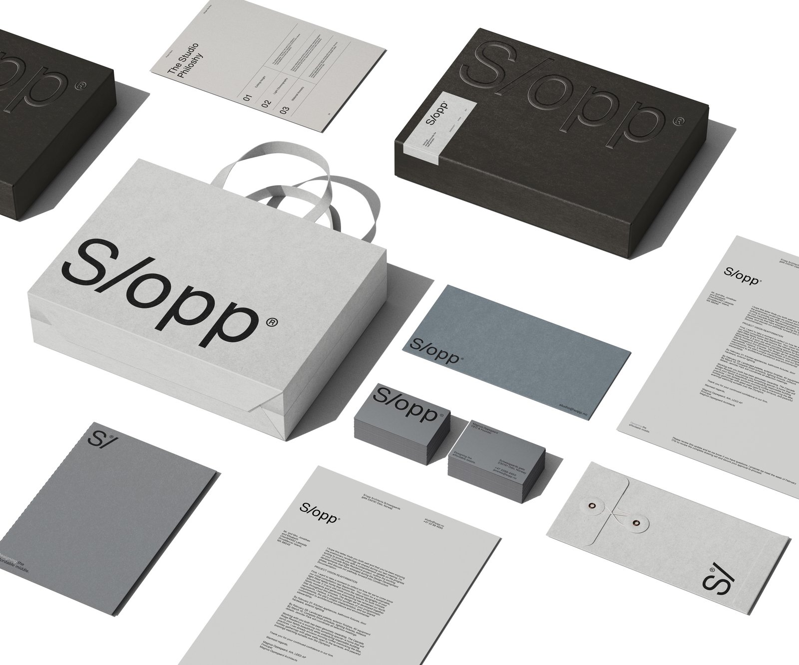
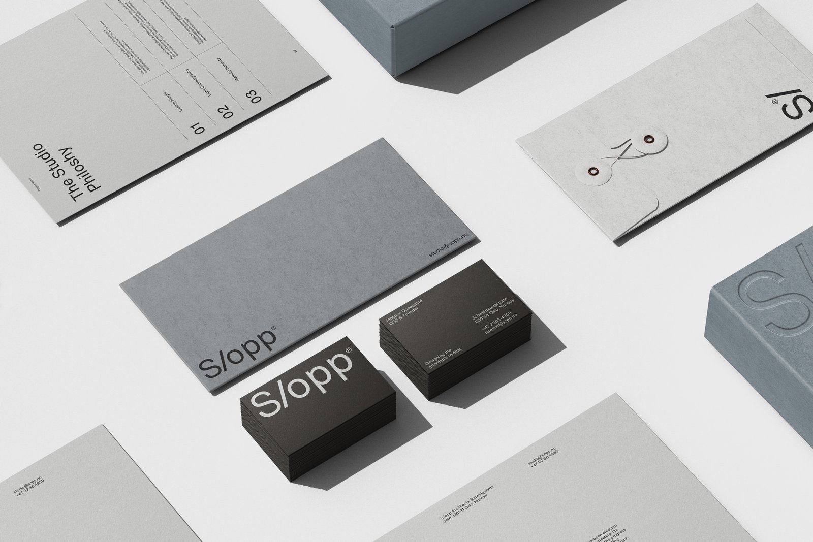
We developed a distinct identity that works seamlessly across print, digital, and environmental applications.
The visual language balances precision with purpose — communicating S/opp’s role as leaders in democratizing architectural quality, and positioning the practice as a firm where good design reaches further than most dare to attempt.
What we did- Naming
- Brand identity
- Typography system
- Brand positioning







Download the S/opp project images.
7 images · ZIP · 2.0 MB. For press and portfolio use — please credit KWIBA®.
Download project images