Alima
Studio
- Scope
- Naming
- Brand Positioning
- Verbal & Visual Identity
- Sector
- Residential Architecture
- Awards
- Behance — Branding gallery
- Behance — Stock gallery
- View on Behance
Alima Studio approaches residential architecture as a discipline of accumulation — where hundreds of precise decisions compound into spaces that function measurably better across years of continuous use.
Millimetres matter.
The practice focuses on residential and small-scale commercial projects where detail work determines quality.
Millimetres matter. The studio needed a name and identity that carried that patience and precision.
Mystery precedes discovery.
a — for Alima. The line that follows creates pause: it separates the letter from its resolution, holding space between question and answer, between concept and execution.
The mark embodies the studio’s philosophy — mystery precedes discovery.
What we did- Naming
- Brand positioning
Curious first, certain later.
a—studio® reads as incomplete and open-ended, mirroring how the studio approaches every commission: curious first, certain later.
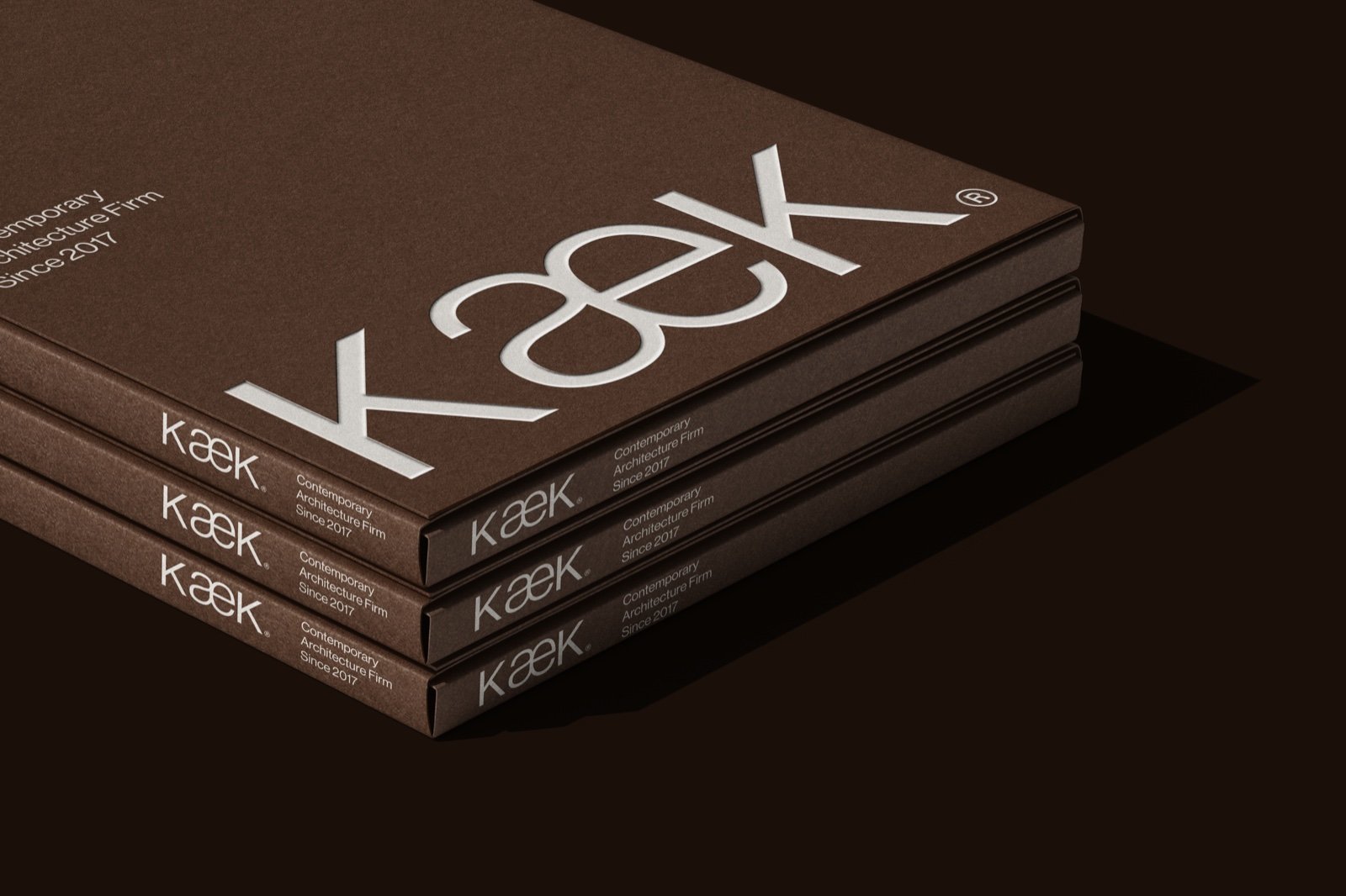
The system carries the line from stationery and packaging to the annual review, signage and site.
What we did- Verbal & visual identity
- Stationery and packaging
- Annual review
- Signage
- Site


Download the Alima Studio project images.
28 images · ZIP · 10.2 MB. For press and portfolio use — please credit KWIBA®.
Download project images